
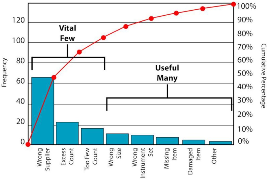
A Pareto chart is a useful visual tool for identifying the factors that have the greatest impact on a particular problem. It combines a column chart with a cumulative percentage line, making it easier to see which categories contribute most to a total.
Microsoft Excel includes a built-in Pareto chart feature, allowing you to create this type of visualisation without complex formulas or advanced charting skills. Whether you are analysing customer complaints, product defects, sales figures or business costs, learning how to create a pareto chart in excel can help turn raw data into useful insights.
What Is a Pareto Chart?
A Pareto chart is based on the Pareto principle, which is commonly associated with the idea that a relatively small number of causes can account for a large proportion of an outcome. This is sometimes referred to as the 80/20 rule, although real-world data does not necessarily follow an exact 80/20 distribution.
A typical Pareto chart contains two main elements. The columns represent individual categories and are arranged from the largest value to the smallest. A line running across the columns represents the cumulative percentage of the total.
For example, a business might record customer complaints under categories such as delivery delays, damaged products, incorrect orders, billing errors and other issues. A Pareto chart can show which complaint categories make up the largest proportion of all complaints.
This makes the chart particularly useful for prioritisation. Rather than treating every issue as equally significant, users can quickly identify the areas that contribute most to the overall result.
How to Create a Pareto Chart in Excel
Before creating a pareto chart in excel, you need to organise your data correctly. Place your categories in one column and the corresponding numerical values in another.
For example:
| Complaint type | Number of complaints |
| Delivery delays |
42 |
| Damaged products |
28 |
| Incorrect orders |
18 |
| Billing errors |
7 |
| Other |
5 |
Select the complete data range, including the column headings. Then select Insert from the Excel ribbon.
In the Charts section, look for Insert Statistic Chart. Depending on your version of Excel, you should see a Pareto option under the statistical chart choices. Select it and Excel will generate the chart automatically.
Excel arranges the columns in descending order and adds a cumulative percentage line. This is one of the main advantages of using the built-in feature because you do not need to calculate the cumulative percentages manually.
If your version of Excel does not include the Pareto option, you can still create one manually. This involves sorting your data from largest to smallest, calculating cumulative totals and percentages, and then creating a combination chart containing columns and a line. Although this method requires more work, it provides greater control over the chart’s construction.
Customising Your Pareto Chart in Excel
Once you have created your pareto chart in excel, you can customise its appearance to make the information clearer.
Start by changing the chart title. A title such as “Customer Complaints by Type” is more informative than simply using “Pareto Chart”. Readers should be able to understand the subject of the chart without having to refer back to the source data.
You can also use Excel’s Chart Design and Format options to adjust the size, fonts, labels and other visual elements. Keep the design relatively simple. A Pareto chart is intended to highlight differences between categories, so unnecessary formatting can make the information harder to understand.
Pay particular attention to the cumulative percentage line. This line shows how much of the total is accounted for as you move from the largest category towards the smallest.
For example, if the cumulative percentage reaches 75% after the first three categories, those three categories collectively account for three-quarters of all recorded complaints. This can provide a useful starting point for further investigation.
If category names are lengthy, consider widening the chart or changing the orientation of the labels. Clear labels are essential when the chart is being used in a report, presentation or meeting.
How to Read and Interpret a Pareto Chart
Knowing how to interpret a pareto chart in excel is just as important as knowing how to create one.
First, examine the columns from left to right. The tallest columns represent the categories with the highest values. Because Pareto charts arrange categories in descending order, the most significant contributors appear first.
Next, examine the cumulative percentage line. This shows the combined contribution of all categories up to each point on the chart. It can help you establish a practical threshold for deciding which categories require closer attention.
For instance, imagine that a manufacturing company analyses product defects and discovers that incorrect assembly, damaged components and incorrect measurements account for most recorded defects. The company could investigate these areas first to understand what is causing them and whether corrective action is required.
However, a Pareto chart does not explain why a particular category has a high value. It identifies the size or frequency of categories, but additional analysis is required to determine the underlying causes.
It is also important not to assume that every Pareto analysis will produce an 80/20 split. The 80/20 rule is a general principle rather than a fixed mathematical requirement. Your chart should be interpreted according to the actual distribution shown by your data.
Tips for Creating an Effective Pareto Chart
When creating a pareto chart in excel, start with accurate and consistently categorised data. If similar issues are recorded under different names, the chart may make their combined importance less obvious.
Use clear category names and make sure all numerical values measure the same thing. For example, avoid combining monetary values with quantities in a single analysis unless there is a specific reason to do so.
You should also consider how an “Other” category is being used. While grouping small categories together can keep a chart manageable, a very large “Other” category could conceal useful information. If it represents a significant proportion of the total, breaking it down into more specific categories may produce a more informative analysis.
Finally, consider who will be viewing the chart. A chart designed for an internal analytical report can contain more detail than one intended for a presentation. In either case, the key message should be easy to identify.
Creating a pareto chart in excel is a straightforward way to transform a collection of figures into a visual summary of priorities. By preparing your data carefully, using Excel’s built-in charting tools and interpreting the results alongside other relevant information, you can create a chart that supports clearer and more focused analysis.