
What is a Histogram?
In a set of data, how often each value is present is shown in a frequency distribution. Now in order to show frequency distributions, the most commonly used graph is a histogram which basically is a graphic or visual presentation of data. Despite the fact that the similar information can be offered in tabular format, in a histogram it is easy to classify different data, categories and the frequency of its occurrence. In a histogram there are two axis in which one is vertical and the other one is horizontal.
Purpose of a Histogram
Generally, the purpose of a histogram is to offer a summary regarding particular data which can be understood easily. A histogram is also referred as a bar chart as it appears like a bar chart; however, there are significant variations between them. One must be aware of the fact that this useful analysis tool of data collection is regarded as one of the seven fundamental quality tools.
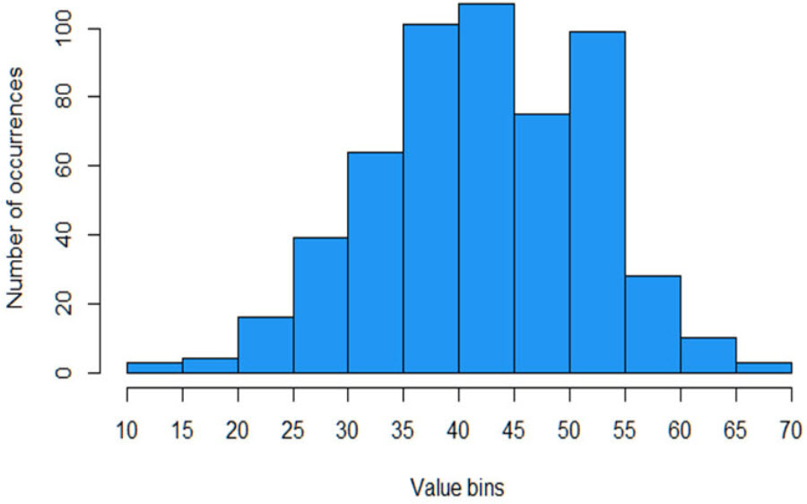
Structure of a Histogram
A histogram has two kinds of information. The first which is “classes” or “bins”, are the data groups indicated by the bars on the chart. The other form of information indicated by the size of the bars is known as “count”. In a histogram, the count of the various bins is represented in visual form through the height of the bars. It is important to keep in mind that what the bins and count stand for should always be clearly labeled in histogram with title of the chart.
What Does a Histogram Show?
A huge data amount and the frequency of the data values can be exhibited in histograms. Now let’s look at what does a histogram show. A histogram can determine the distribution and median of the data. Basically, a histogram is intended to offer immediate understanding of different types of information, covering the mean, lowest and highest values of the data displayed on the chart.
Moreover, further calculations that are prepared from the histograms comprise discovering standard deviation in the data plus the class width standing for the range on the chart from the left to the right. Furthermore, any gaps or outliers in the data can be shown by a histogram.
Outliers can be explained as tremendously small or high values that do not come near any additional data points. Occasionally unusual cases are represented in outliers and at other times data entry mistakes, or possibly data that does not fit in with the other data of interest are represented in it. With the help of using a histogram outlier can easily be recognized in any case and should be examined since they can demonstrate attention-grabbing information regarding our data.
Additionally, the information derived from histograms can also become handy in tracking of trends. Suppose, if the horizontal line has to be divided into 12 sections symbolizing January to December and we divide the vertical line into temperatures, the trend of temperatures can be seen throughout the entire year.
Hopefully the above paragraphs have answered your question related to what does a histogram show.