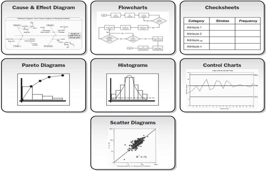
Quality tools are helpful in monitoring and management of quality system in an organization. Karou Ishikawa, a Japanese quality guru, was the first one to emphasize on seven basic quality tools and stated 90% of all quality related issues can be solved only by using these basic tools.
The seven basic tools of quality are:
- Cause and effect diagram
- Flow chart
- Check sheet
- Pareto chart
- Control charts
- Histograms
- Scatter Diagram
In the sections below each of the seven basic tools of quality will be described in further details.
The Seven Basic Tools of Quality
Cause and Effect Diagram
The cause and effect diagram is also called fishbone diagram. It is used for root cause analysis and it identifies all the possible causes of a problem. As its name indicates, it identifies the causes for particular effects. It represents the causes graphically and also encourages group participation. It is also used in brainstorming and in designing of a new product.
The effects are written on right hand side of the chart representing head of a fish (as its name fish bone diagram) and the causes are written on left side representing bones of the fish. This process continues until you reach the root cause of the problem.
Flow chart
Flow chart is a very famous term and many are familiar with it. It is a chart that describes relationship between different steps in a process. It is very helpful in identifying any problem or defect that are present or that can occur in a process. The graphical representation is considered to be more effective than words for understanding certain processes. Flow chart also helps in workflow management by identifying waste production and any defects, which is very important in terms of fulfilling customer’s needs and requirements.
Check sheets
Check sheets are the forms or sheets that are used for data collection and analysis. The data collected can be on location, frequency, problems and their causes as well. A check sheet is basically in a tabular form which is divided into different sections. The data collected is then entered or marked in these check sheets. A check sheet may also be called as “tally sheet” if data collected is quantifiable.
Check sheets are also used to depict that all the steps in are being followed or not. It helps a lot when there are simultaneous processes going on also take in account the quality of that process. It can also be used to determine causes of a problem or defect which is very helpful in quality complications.
Pareto charts
Pareto charts are developed by Vilfredo Pareto, hence the name Pareto charts. It is the visual representation of defects and their causes in the form of graphs or bars. It follows the 80/20 principle which predicates that 80% of the issues are due to 20% of the defects. The issues are recorded on the basis of their frequency of occurrence to conclude the order of fixing them. The frequency is recorded in descending order so that the problems that are occurring more frequently should be resolved first. Hence it helps to portray the significance of causes and how solving the specific cause improvises the system.
Control charts
The control chart was developed by Walter A. Shewhart so they are also called as Shewhart charts. These charts describe that whether the process is in control and able to fulfill customer’s demands or not. The data is described in form of statistics. It helps to find out the stability of the process as well. The y-axis represents data or measurement to be collected and x- axis represents time when the measurement was taken. The central line on graph shows the planned or average value. An upper and lower limit is also defined. Thus it can easily be concluded from the graph that whether the process is in control and within defined limits or not.
Histograms
Histograms were developed by Karl Pearson. It is the bar graph that represents frequency distribution. It determines the sustainability of data in the likely distribution and factors that rerun more frequently. Thus it prioritizes and identifies the factors that need to be handled first.
Scatter Diagram
Scatter diagrams are graphs that identify relationship between different variables as well as the root cause analysis. The x- axis represents the independent variable against the dependent variable on y- axis. The relation can be in various forms such as linear, exponential, logarithmic etc.
Conclusion
The seven basic tools of quality are essential for any business. They are powerful in the sense that they are basic tools which are easy to learn and can solve the majority of the issues a business encounter.
