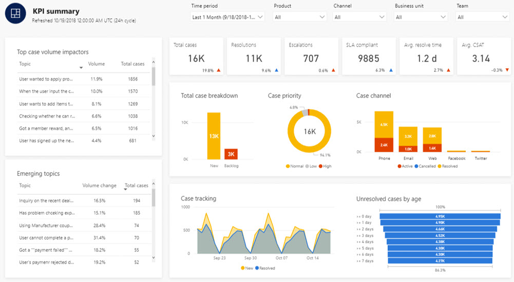
A Key Performance Indicator (KPI) dashboard is a powerful tool for monitoring and managing the success of your business. It provides a visual snapshot of critical metrics, helping you make data-driven decisions. However, the effectiveness of your KPI dashboard depends on what you choose to include. In this article, we’ll explore the essential elements to consider when deciding what to include on your KPI dashboard.
Key Performance Indicators (KPIs): The Foundation
The cornerstone of any KPI dashboard is, of course, the key performance indicators themselves. These are the specific metrics and data points that reflect the performance of your business in various areas. Selecting the right KPIs is critical, as they will drive the decisions you make. Here’s how to go about it.
1. Identify Your Business Goals
Start by aligning your KPIs with your business goals. What are the most important objectives you want to achieve? Are you looking to increase revenue, improve customer satisfaction, boost efficiency, or reduce costs? Your KPIs should directly relate to these goals.
2. Keep It Focused
While it’s tempting to include numerous KPIs to cover all aspects of your business, it’s essential to keep your dashboard focused. Overloading it with KPIs can make it cluttered and less effective. Typically, aim for 5 to 10 KPIs that are most relevant to your business’s current objectives.
3. Choose Measurable and Actionable KPIs
Your KPIs should be measurable, meaning they can be quantified. Additionally, they should be actionable – meaning that you can influence or control the outcomes. For example, if one of your goals is to improve customer satisfaction, a measurable and actionable KPI could be the Net Promoter Score (NPS), which is directly influenced by your customer service efforts.
4. Prioritise Leading and Lagging Indicators
Leading indicators are predictive metrics that can help you anticipate future performance, while lagging indicators are historical metrics that reflect past performance. It’s beneficial to include a mix of both on your dashboard. For instance, if you’re focusing on sales growth, a leading indicator might be the number of leads generated, while a lagging indicator could be the actual revenue generated.
Data Sources: Where to Get Your Information
Once you’ve identified your KPIs, you’ll need to decide where the data to measure them will come from. The accuracy and reliability of your data sources are crucial for the effectiveness of your KPI dashboard. Here are some considerations.
1. Internal Databases and Systems
Many businesses generate and store a vast amount of data in their internal databases and systems. These can be a valuable source of data for your KPIs. Whether it’s sales data, customer data, or operational data, internal systems can provide real-time, accurate information.
2. Third-party Tools and Integrations
In some cases, you may need to leverage third-party tools and integrations to gather data. These tools can range from marketing analytics platforms, CRM systems, to financial software. Ensure that your chosen tools are compatible with your KPI dashboard software to enable seamless data integration.
3. Manual Data Entry
While automated data sources are preferable, there may be situations where you need to rely on manual data entry. For example, if you’re tracking employee performance, data such as the number of completed tasks might need to be entered manually. In such cases, ensure a streamlined process and accuracy checks.
Data Visualization: Presenting Your KPIs Effectively
Once you have your KPIs and data sources in place, it’s time to focus on how you present this information on your dashboard. The goal is to make the data easily understandable and actionable. Here’s what to consider.
1. Choose Appropriate Visualizations
Select the right visualisations for each KPI.
- Line charts: work well for showing trends over time.
- Bar charts: can be used to compare data across categories.
- Pie charts: are useful for displaying parts of a whole.
- Heatmaps: can help visualise data density.
Ensure that your chosen visualizations effectively convey the story behind the data.
2. Keep It Simple and Focused
Cluttered dashboards can be overwhelming and counterproductive. Each element on your dashboard should serve a purpose and contribute to the overall understanding of your KPIs. Avoid unnecessary decorations or distractions.
3. Customise for Your Audience
Consider the needs and preferences of your dashboard’s users. A dashboard for your executive team may require different visualizations and a higher-level overview than a dashboard for your marketing department. Tailor the dashboard to cater to the specific audience.
4. Real-time Updates
For the most effective use of your KPI dashboard, ensure that the data is updated in real-time or at regular intervals. This ensures that your team can react promptly to any significant changes in the KPIs.
Conclusion
A well-structured KPI dashboard can be a game-changer for your business, providing real-time insights and facilitating data-driven decision-making. To create an effective KPI dashboard, you must start with the right KPIs, use reliable data sources, and present the information in a clear and engaging way. By following these guidelines, you’ll have a powerful tool that helps your organisation monitor and manage its success. Remember, your KPI dashboard is a dynamic tool that should evolve as your business goals and priorities change. Continuously review and update it to stay on the path to success.
In conclusion, a KPI dashboard is only as good as the components it comprises. By carefully selecting the right KPIs, ensuring data accuracy, and presenting information effectively, your KPI dashboard will become an invaluable asset in your business’s journey towards success.


