A scatter graph (also called a scatter plot or scatter chart) is a kind of graph or mathematical diagram which uses Cartesian coordinates to present values for two variables or a set of data. It illustrates how much one variable correlates by the other. Correlation is the relationship between two variables.
Scatter graphs are generally used for displaying and relating numeric values, such as statistical, scientific, and engineering data. These graphs are beneficial to show the connections among the numeric values in numerous data series and can plot two groups of numbers as one sequence of XY coordinates.
When to Use a Scatter Graph as Part of Work
Below are some examples of when it would be practical to use scatter graphs as part of your work.
- If you want to display worksheet data that includes pairs or grouped sets of values.
- To determine if a dependent variable have multiple values for each value of an independent variable.
- If you have large amounts of data sets and want to see if there is a pattern.
- To analyse how strong a correlation is between two variables as part of a root cause analysis.
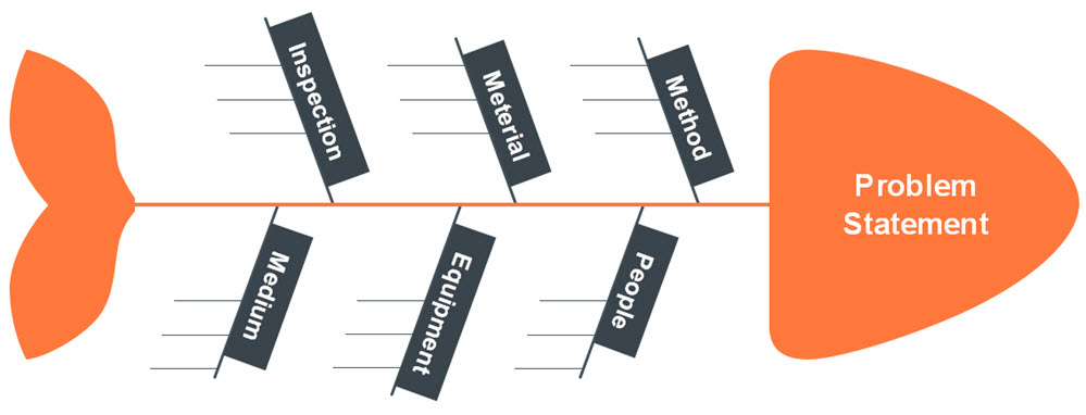
- If you objectively want to determine if a cause and effect in a fishbone diagram are related.
You can use various technologies to create a scatter graph; some of the most common ones are listed below.
- A SPSS Scatter plot
- A Scatter plot in Minitab
- A TI 89 Scatterplot
- A Scatter plot in Microsoft Excel
- A TI 83 Scatter plot
How to Draw a Scatter Graph in Excel
Using excel is easier for constructing a scatter graph or plot, below are the steps to take.
- Type in your data into two columns.
- Click “Insert” then click “Scatter”.
- Choose a type of plot. For example, click the first icon (scatter with only markers).
Formatting
Excel have different options to do some formatting of the graph, a couple of them are listed below.
Delete the Legend.
- Right click on the legend, then press “delete.”
Clean up the White Space.
- Click the “Layout” tab, and then click “Axes”.
- Click “Primary Horizontal” then click “More Primary Horizontal Options”.
- Click the “Fixed Value” radio button and then type in a value for where you want your horizontal axis to start. Click “Close”.
- Redo Steps 1 to 3, selecting “Vertical” instead of horizontal.
Adding Chart Labels
- Click the “Layout” tab.
- Click “Axis” titles and then click “Primary Horizontal Axis Title”.
- Choose a position. For example, you may want the title below the axis.
- Click the text and type in your new label.
- Repeat Steps 1 to 4, choosing “vertical” for the vertical axis.
Adding a Trend-line
- Click the “Layout” tab.
- Click “Trend-line” and then click “More trend-line Options”.
- Click the “Show equation on chart box” and then click “Close”.
How to Draw a Scatter Graph By Hand
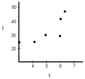
There are only three steps to constructing a scatter graph by hand. As an example let’s look at how to draw a scatter graph for the following data.
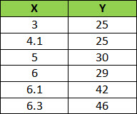
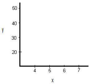
Draw a graph and Label the x and y axis. Select a range that contains the maximums and minimums from the given data. For example, the x-values go from 3 to 6.3, so a range from 3 to 7 would be suitable.
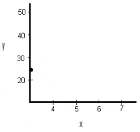
Draw the first point on the graph which is (3, 25).
Draw the remaining points on the graph.
How to Draw a Scatter Graph in Minitab
- Enter your data into two columns. One column should be the x-variable (the independent variable) and the second column should be the y-variable (the dependent variable). Ensure you insert a header for your data in the first row in each column; that will allow the creation of the scatter plot easier in Step 4 and Step 5.
- Click “Graph” on the toolbar and then click “Scatter plot”.
- Click “Simple” Scatter plot. In most cases, this is the option you’ll use for scatter plots in elementary statistics.
- Select your y variable name at the left window, and then click “Select” to move that y variable into the y variable box.
- Choose your x variable name this time at the left window, and then click “Select” to move that x variable into the x variable box.
- Finally, select “OK” to create the scatter plot in Minitab. Now the graph will appear in a separate window.
And that is all on how to draw a scatter graph! Easy right? Just try it out.


