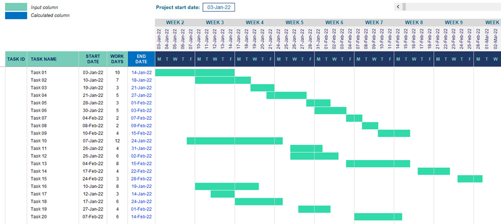
Project management relies heavily on visual tools to communicate timelines, dependencies, and progress. One of the most widely used tools for this purpose is the Gantt chart, a horizontal bar chart that shows a project schedule over time. While specialist software exists for creating Gantt charts, many people prefer using Microsoft Excel because it is widely available, flexible, and familiar. Learning how to develop a Gantt chart in Excel can help you plan, track, and manage projects more effectively without needing additional tools.
This article explains the basics of Gantt charts, provides a step-by-step guide to creating a Gantt chart in Excel, and offers practical tips for making your chart both functional and visually appealing.
Understanding the Purpose of a Gantt Chart
A Gantt chart is designed to visually represent the tasks or activities in a project along a timeline. Each task is represented by a bar that spans the period during which it is scheduled to be completed.
The key features of a Gantt chart include:
- Task list: A column displaying all the project’s tasks or milestones.
- Timeline: A horizontal axis showing days, weeks, or months.
- Bars: Horizontal bars indicating when tasks start, how long they will take, and when they will end.
- Dependencies: Relationships between tasks, showing which ones must be completed before others can begin.
The benefits of using a Gantt chart include clearer communication, improved organisation, and better time management. By seeing all tasks and their timelines in one place, project managers and teams can quickly identify delays, overlaps, and bottlenecks.
Step-by-Step Guide to Creating a Gantt Chart in Excel
While Excel does not have a built-in Gantt chart feature, it can be created by customising a stacked bar chart. Here’s how to do it:
Step 1: Prepare Your Data
Create a table with the following columns:
- Task Name: The list of activities or milestones.
- Start Date: When each task begins.
- Duration: The number of days (or other units) each task will take.
Step 2: Insert a Stacked Bar Chart
- Highlight the Start Date and Duration columns (including headers).
- Go to the Insert tab in Excel, select Bar Chart, and choose Stacked Bar.
Step 3: Format the Chart to Look Like a Gantt Chart
- Right-click the chart and choose Select Data.
- Edit the Horizontal Axis Labels to display your task names.
- The bars representing the start dates will act as invisible spacers. To hide them, select them, right-click, and choose Format Data Series, then set Fill to No Fill.
- The remaining bars will represent your tasks’ durations.
Step 4: Adjust the Timeline
- Right-click the date axis and choose Format Axis.
- Set the minimum and maximum bounds to match your project’s timeline for clarity.
Step 5: Enhance the Appearance
- Apply colours to distinguish different phases of the project.
- Add gridlines for better readability.
- Include milestone markers for key dates.
With these steps, you have successfully created a basic Gantt chart in Excel that can be updated as your project progresses.
Tips for Making Your Gantt Chart in Excel More Effective
Keep It Simple
Too much detail can make your Gantt chart difficult to read. Limit the number of tasks shown, especially if the chart will be shared with stakeholders who only need a high-level overview.
Use Conditional Formatting
If you want your chart to be more dynamic, use Excel’s conditional formatting features to automatically highlight overdue tasks or those approaching deadlines.
Update Regularly
A Gantt chart in Excel is most useful when it reflects the current state of the project. Make it a habit to review and update it at least once a week, or more often for fast-moving projects.
Save as a Template
If you manage projects regularly, save your Gantt chart as an Excel template. This way, you can reuse the format without having to rebuild it from scratch each time.
Advantages of Creating a Gantt Chart in Excel
Choosing to build a Gantt chart in Excel offers several practical benefits:
- Accessibility: Most professionals already have Excel installed, eliminating the need for new software.
- Flexibility: Charts can be customised extensively to fit specific project needs.
- Cost-effectiveness: Using Excel avoids subscription fees for dedicated project management software.
- Integration: Data from other Excel sheets can be easily linked to your Gantt chart for automated updates.
While specialised tools may offer more advanced features like automatic dependency tracking, Excel remains a strong choice for straightforward projects or when budget constraints are a factor.
Conclusion
Creating a Gantt chart in Excel is a valuable skill for anyone involved in project management. By following a clear step-by-step process—preparing your data, inserting a stacked bar chart, and formatting it correctly—you can produce a professional, easy-to-read project timeline without specialised software.
An effective Gantt chart in Excel can help you visualise your project’s progress, identify potential delays, and keep your team aligned. With thoughtful design and regular updates, this simple yet powerful tool can greatly improve your ability to deliver projects on time and within scope.
