Pareto chart is simply a basic quality tool to help identify frequent defects, complaints, or other factors as part of a data analysis study. It is a deceivingly simple concept which can have huge benefits when analysing data. The Pareto owns its existence to Vilfredo Pareto. The famed economist evidenced that 80% of the results come from 20% of the causes.
What is a Pareto Chart?
Pareto charts simply graph the frequency of your defects and the cumulative impact of each defect. The science behind graphing the frequency of each defect is that it makes it easier for the observer to prioritize the defects most in need of attention. Based on this, the resources available can be used solve the issues where it will bring the greatest overall improvement and add most value.
What will a Pareto Chart show?
A Pareto chart normally consists of two parts, a bar graph and a line graph.
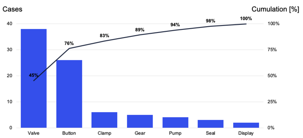
The bar usually represents a type of defect or problem, while the height of the bar represents the frequency of the defect. The bars are always presented in descending order so that you can see the most frequent defects first.
The line graph on the other hand represents the cumulative percentage of defects.
In Pareto charts, the first bars, by virtue of design, will always be the tallest. The first bar will always show the common source of the problem, but the most common defect may not always bring about the best improvement and this is where the line comes in. The line and the bar work in conjunction to help you prioritize the defects to bring about the most overall improvement.
How to draw a Pareto Chart?
Following steps can be used when deciding on how to draw a Pareto Chart:
- Understand that the first step in solving a problem is identifying it. Develop a list of problems, items, or causes so that you can compare them.
- Develop or settle on a standard measure for comparing the defects. The standard could be:
- The frequency of the occurrence
- The time it takes to complete?
- What resources does it utilize?
- Settle on a time-frame from which the data will be collected.
- Now, you will need to tally how often do these problems or defects occur for each defect. You should then find the total of all the defects and the percentage of each defect in the total.
- Now, you will need to list the defects in order of frequency: e.g., the most frequent come first and all others follow based on frequency.
- Next, you will have to plot a graph. You will need to list the defects on the horizontal axis of the graph from highest to lowest. Each bar will represent a defect and the height of the bar will showcase the standard measure indicated on the left vertical axis (e.g., frequency, time, or cost). The right vertical axis will show the cumulative percentages (the cumulative total should equal 100 percent).
- Draw a line graph of the cumulative percentages. The line should correspond to the cumulative-percentages as measured on the right vertical axis. The first point of the line graph should be at the top of the first bar otherwise you have made a mistake.
- Step-8 is the analyzing part. Analyzing is easy; you will just need to spend some time; see the frequency of each defect and come up with a way to solve the defect that brings about the most improvement and adds most value.
Pareto chart is a marvel of modern scientific innovation and the principle first used for economics will help anyone in making a decision. When you have decided on how to draw a pareto chart, you will find it is simple to use and can bring massive benefits to your data analysis process.


