
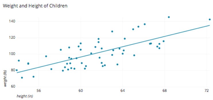
A scatter plot is a two-dimensional data representation that uses dots to show the values acquired for two different variables, one plotted along the x-axis and the other plotted along the y-axis. For instance this scatter plot below demonstrates the height and weight of a fictitious set of children.
When entering a huge amount of data into a table, any attempt to reach a conclusion about the data from the table would be impossible to the normal person. However if you plot pairs of data in a graph to visualize it, it becomes easy for the human brain to interpret it. To perceive how the factors identify with each other, you make scatter plots. So what is a scatter plot? A scatter plot is a graph that is used to plot the data points for two factors. Each scatter plot has a horizontal axis (x-axis) and a vertical axis (y-axis). One variable is plotted on every axis. Scatter plots are made of marks; each mark shows to one member’s measures on the factors that are on the x-axis and y-axis of the scatter plot.
Most scatter plots contain a line of best fit, it’s a straight line drawn through the center of the data points that best shows to the pattern of the data. Scatter plots give a visual portrayal of the correlation, or connection between the two factors.
Types of Correlation
All correlations have two properties: direction and strength. The direction of the correlation is controlled by whether the correlation is positive or negative. The strength of a correlation is determined by its numerical value.
Positive Correlation
Both variables move in the same direction. In other words, as one variable increases, the other variable also increases. As one variable decreases, the other variable also decreases.
Example: years of education and yearly salary are positively correlated.
Negative correlation
The variables move in opposite directions. As one variable increases, the other variable decreases. As one variable decreases, the other variable increases.
Example: hours spent sleeping and hours spent awake are negatively correlated.
Let’s continue to look at how we would go about Interpreting a Scatter Plot.
Interpreting a Scatter Plot
Interpreting a scatter plot is useful for interpreting patterns in statistical data. Every observation in a scatter plot has two of the coordinates; the first one corresponds to the first piece of data in pair (that is the X coordinate; amount that you go left or right). The second corresponds relates to the second piece of data in pair (that is the Y-coordinate; amount that you go up or down). The point showing to that observation is placed at the intersection of the two directions.
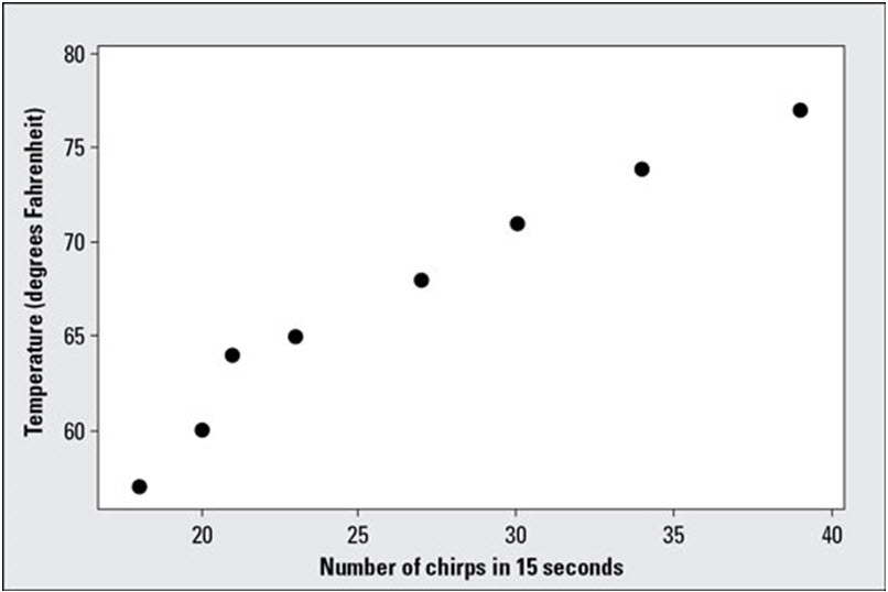
The above image shows a scatter plot for the temperature and cricket chirps data listed in the table below
Cricket Chirps and Temperature Data:
|
Temperature (F’) |
Number of Chirps (in 15 Seconds) |
|
57 |
18 |
|
60 |
20 |
|
64 |
21 |
| 65 |
23 |
|
68 |
27 |
|
71 |
30 |
| 74 |
34 |
| 77 |
39 |
Because the data are ordered as per their X-values, the points on the scatter plot correspond from left to right to the observations which is given in the table, in the order listed.
If the data shows an uphill pattern as you move from left to right, this then indicates a positive relationship between X and Y. As the X-values increase (move right), the Y-values tend to increase (move up).
If the data show a downhill pattern as you move from left to right, this indicates a negative relationship between X and Y. As the X-values increase (move right) the Y-values tend to decrease (move down).
If the data don’t seem to match any kind of pattern, then no relationship exists between X and Y
One pattern of special interest is a linear pattern, where the data has a general look of a line going uphill or downhill. Looking at the preceding figure, you can see that a positive linear relationship does appear between the temperature and the number of cricket chirps. That is, as the temperature increases, the number of cricket chirps increases as well. Note that the scatter plot only suggests a linear relationship between the two sets of values. It does not suggest that an increase in the temperature causes the number of cricket chirps to increase.
Interpreting a scatter plot can be very useful during problem solving if you want to understand the correlation between two factors to validate if there is a potential of it affecting a particular issue.


