We all heard about hot tools and topics in internal audits, heat maps, data analytics, data visualization, big data and many more to mention. However, not many practitioners execute and implement these tools to develop a graphical or visual representation of information and data.
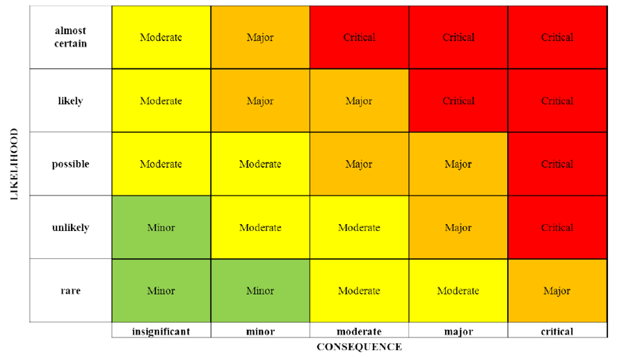
We are here to show you how to make a risk heat map. The heat map is a helpful tool for communicating trends, risks, and opportunities to company’s stakeholders like process owners, executives, and audit committees.
A risk heat map is basically a tool that presents the outcome of a risk evaluation procedure in a visual, concise and meaningful way.
It does not matter if an organization is conducting on broad level or focusing narrowly, the risk assessment or risk evaluation is a crucial stage in risk management. It requires assessment of the potential and likelihood affect of identified risks.
The heat maps are a method of showing the quantitative and qualitative assessments of the possibility of the risk happening and the affect on the company if it experienced a particular risk in the event. It smoothes the progress of discussion by sending the divulge data in more appealing form rather than in a conventional way.
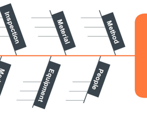
Before developing it, we must know that there are several crucial elements in it. Such as common comprehension of organization’s risk appetite. The affect level which would be documentation to the organization. Last but not the least, a common language for allocating potential and probable impacts.
In three steps using standard software like Microsoft Excel, the auditors can develop their first risk heat map.
Before creating a Risk Heat Map through Excel pivot table, we must tell you that there are two other options as well, such as creating a risk heat map through Excel scroll bar and another heat map in Excel through Radio Buttons. Today, we will tell you the easiest way to create a risk heat map through Excel pivot table.
First You Have to Obtain and Then Restructure the Data
You need to begin with obtaining all the raw data. For instance, we acquired termination and new hiring data from a middle scale retail business. Once your auditors have the data, now restructure it by filtering it to last 12 months only.
Now make the columns of ‘day’ and ‘month.’ The formula is =text(b2,”dddd”) to yield weekday, then use this formula =text(b2,”mmmm”) to yield month.
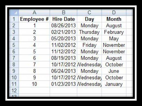
Note: Only first ten employees are depicted in the below illustration.
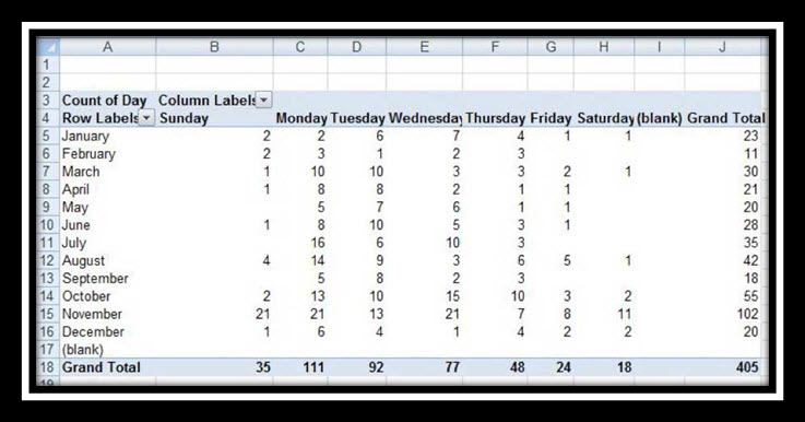
Now Make A Pivot Table
A pivot table is a function of Excel sheet that allows you to summarize the data for analysis in a significant amount. Now make a pivot table by choosing the ‘Day’ and ‘Month’ data in C and D columns. (see the image below)
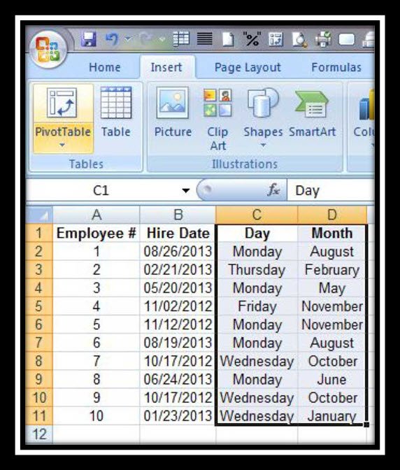
Now go to ‘Insert’ then in ‘Tables,’ select ‘Pivot Table’ from there. The tap will generate a pivot table on a new sheet. Now after the pivot table creation, move the ‘Days’ section into the ‘Values’ field of Pivot Table maker. (see the image below).
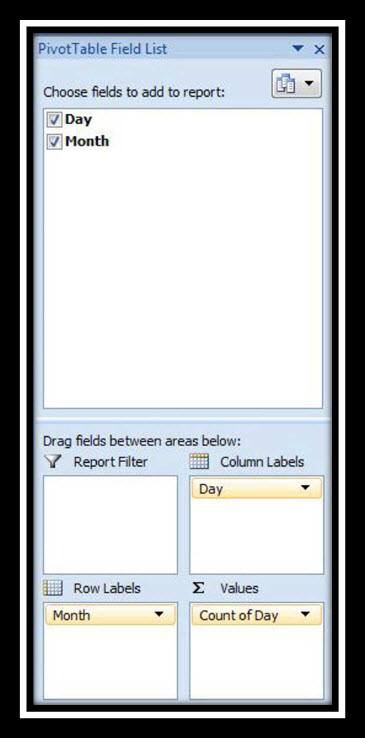
The following pivot table should look a lot like the illustration given below.
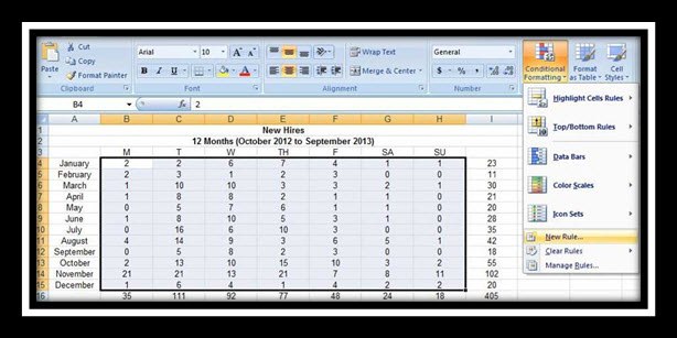
Build The Risk Heat Map
Now copy all the data in a new sheet, fine-tune the column widths and row heights, and add headings of day and month. Go to Home, highlight data and then choose ‘Conditional Formatting.’ (See the image below)
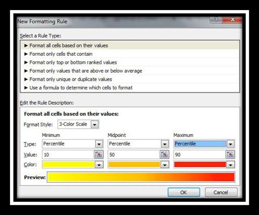
Choose the ‘Rule Description’ and ‘Rule Type’ options presented in the next picture and click OK:
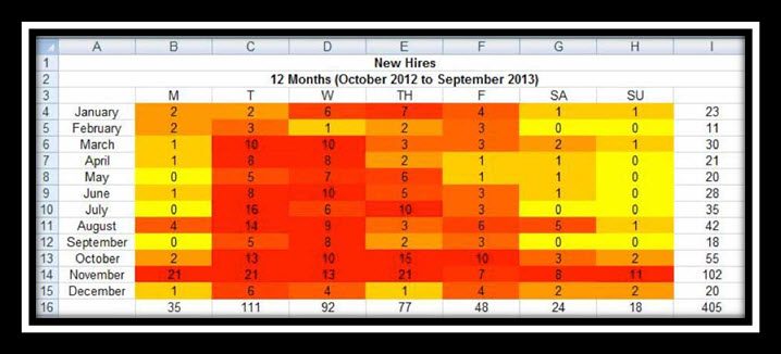
Now the risk heat map will resemble with the illustration given below.
Wrapping It Up
So, this is how anyone can create risk heat map. After building it, it is time for analysis. The internal auditors of the organizations can use utilize risk heat maps in various ways, including assessment of risk, detection of fraud, and reporting of the audit.
So, what the is risk heat map showing you above? What if we tell you that this data and information is of a medium scale retailed business and their most significant sales days happens on Black Friday every year?
The auditors can alter their heat map, like managing the colors or percentiles to enhance the display data for their audience. You can play and have fun with it, but remember to reflect the original data accurately.


