In a scatter plot, dots are used basically to signify values regarding two diverse numeric variables. There are also some other names of a scatter plot for instance scatter graph, correlation chart, and scatter diagram. In a scatter plot the position of every dot on the vertical and horizontal axis shows values for a single point of data. They are useful across various industries such as social statistics, business, data science, biology and many others.
Purpose of a Scatter Plot
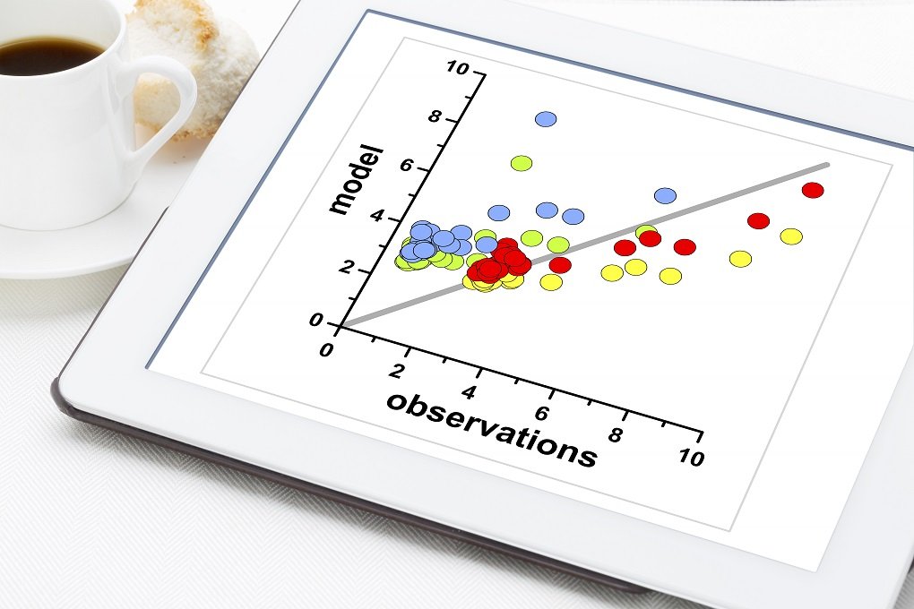
In this day and age, scatter plots can be used in a various range of scenarios. They are used to observe trends over time, interactions between variables, performance tracking in contrast to a target, and relate numerous parts as a whole. However, the main purpose is to display the extent of how much one variable can affect the other one. Another purpose of scatter plot is to facilitate us in forecasting the behavior of one variable (dependent variable) on the basis of the extent of the other variable (independent variable). It must be kept in mind that scatter plots are not used very often in visualization type of charts; however, they still play a vital role. Scatter plot represent huge quantities of data and show correlation between variables. Furthermore, they are a useful instrument in order to work with linear regression models.
The key uses of scatter plots are to spot and demonstrate associations between two numeric variables. With the help of scatter plots it is common to identify correlational relationships. In this type of situation, we will want to understand that if a specific horizontal value was given then for the vertical value what a good forecast would be. Generally, we will notice that on the horizontal axis the variable is indicated as an independent variable, and on the vertical axis the variable is symbolized as a dependent variable.
There are different ways to describe the relationships between variables such as linear or nonlinear, positive or negative, strong or weak. Commonly, the first one is referred as independent in case of a relationship between two variables. Since its values count on the first variable so the second variable is known as dependent. However, the possibility of no relationship between two variables at all also exists.
Positive Correlation
The positive correlation is described as the increase in dependent variable with an increase in independent variable. In this regard, a good example will be of height and clothes size. When there is an increase in height of a child there will be also increase in clothes size. One more common case in point will be the correlation between weight and height.
Negative Correlation
If the increase in one variable results in decrease in the other variable then it will be known as negative correlation. For example, there’s a negative correlation between car age and car price. Generally, when age of a car increases then there is a decrease in its price.
No Correlation
When we say ‘No correlation’ it implies that no relationship exists between the variables. Such as, there is no correlation between the clothes size of children and their grades at school.
When a Scatter Plot Should be Used
Scatter plot can be helpful for detecting additional patterns in data. The data points can be divided into groups on the basis of how closely collections of points group together. Moreover, they can also demonstrate the existence of any unpredicted gaps in data as well as any outlier points.
Advantages
The purpose of a scatter plot is to present an association and a trend in the relationship of data which has many advantages. It displays every data point which covers maximum, minimum and outliers. Scatter plot preserves the exact sample size as well as data values. One cannot negate that there are some limitation of Scatter plots such as subjective interpretation. Still, they are a powerful instrument for indications and displaying patterns and link between some datasets when used in a controlled manner.


